The pictures, graphics, and charts that you put into your scientific publication can make or break its success. Often, before reading a paper, people will look through the abstract to get an idea of whether reading will be worth their time. Next, following the SQ3R reading method, many readers survey the publication for graphics and headings before reading the piece. All of the figures you put into your publication should provide your audience with a deeper understanding of the work you have done and the results of your project. Taking the time to make sure your graphics display your research project in the best way is essential to publishing a paper. Here I will discuss the 10 Cs of publishing quality charts and graphics in the life sciences.
|
|
||
Clarity
Of the 10 Cs I will discuss, clarity of information is by far one of the most important. The graphics in your publication need to be easy to read and understand. Text used in your figures should be easily legible. Most journals will have their own requirements that you will need to follow once your manuscript is accepted, but you can also begin following some of these best practices to enhance clarity with your first draft:
1.Units should in standard SI format or standard practice for your field of study.
2.When working with very large or very small numbers, present them using scientific notation rather than decimal form.
3.Only include significant digits.
4.Ensure all graphics are called out in your manuscript.
One way to evaluate the clarity of information presented in your graphics is to get an undergraduate’s perspective. Are they able to understand what the charts and captions are trying to say? If not, get their feedback on how to fix them. Clarity of information is important not only for researchers in your field, but also to the general public who may stumble upon articles or information related to your research and look to your paper for more facts. It is also important to the undergraduate student who is going to be citing your paper.
|
|
||
Captions
Following along with clarity of information, captions can often be the most essential aspect of a graphic—without a quality description of what is being portrayed, the graphic may be meaningless to readers who come from a different scientific discipline. Effective captions should give an understanding of what results are being communicated by the graphic to an audience of any type. Depending on the type of illustration, different elements should be included.
1.Captions should be below the figure and include a figure number.
2.Any axes and curves should be described in detail.
3.Include important conditions under which experimental results were obtained.
4.Any units used in the caption should be matched exactly to those in the figure.
5.Captions are often two sentences, with the first telling what is being depicted and the second being a brief statement of the results or what the reader should obtain from the caption.
To better understand the importance of good captions, I recently interviewed Ari Daniel, a Digital Producer for "PBS NOVA" and an independent science reporter. Daniel has extensive experience as both a science journalist and a scientist. He explained that the visuals presented in a publication are going to be important; however, without clear interpretation it can cause confusion.
“Visuals can often be incredibly important for telling a story…But they can become a kind of shorthand — like a chemical reaction that’s very clear to a chemist but may not make much sense to someone who doesn’t understand it,” Daniel said. “So even a pretty diagram or a beautiful staining of a cell doesn’t matter without a good explanation of what’s going on. You need a good description to drive your point home.”
Daniel’s conclusion about captions is that having impactful graphics is helpful, but for people to understand them, clear captions are essential. Remember that people will often skim through the graphics of your publication before reading it, so captions should be clear. The caption can serve the purpose of providing some insight into the figure before the article is read at length.
|
|
||
Crowd
When discussing clarity and captions, consider that the reader’s ability to understand the graphics in your paper depends on whether they are another researcher in your field, a researcher from another field, a student or even a member of the general public. Since all of these different audiences will have a varying level of experience in your specific field, outside your specific field and within science as a whole, it is important to identify who your primary audience is. Once you know who you’re writing for, you can cater your information to fulfill the rest of the Cs. Regardless of who you’re writing for, keep in mind that others will inadvertently find your article, so finding a balance between writing for your primary audience and the general public is important.
In my interview with Daniel, he suggested the use of a graphical abstract.
“One recommendation I might have, if the budget allows, [is] if there could be some sort of popular graphic or general audience visual that could accompany an article. That would be really helpful,” Daniel said.
Including this type of succinct, visual summary with meaningful information can help someone with less expertise in a subject to get an idea of what the research is about in a broad sense. Within the manuscript, more detail will be provided for those readers who have experience with the specific field.
“In a review article, you often see a kind of overview figure,” Daniel said as an example. “…It’s like, here’s the state of the field and what we know.”
Daniel went on to state that the graphical summary would be great to include in the actual article but if there is a budget that puts constraints on printing costs, it could be used as a supplemental graphic on the journal’s website.
|
|
||
Choice
The next C is choice, and choice has to do with a few things: What data do I have that I should be presenting graphically? What images should I use? And what type of chart will best represent the data? Answering these questions will help you to make a choice about your graphics.
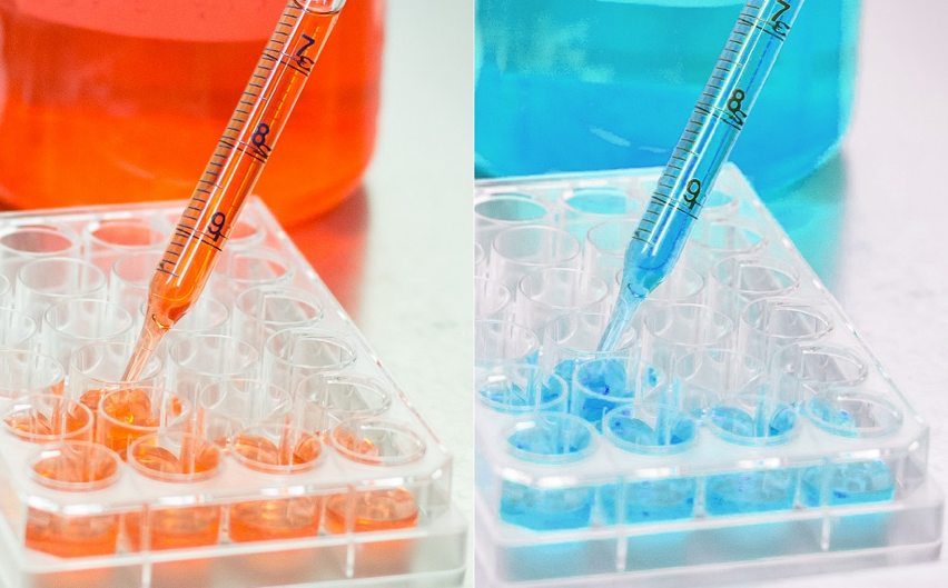
First of all, the graphics are meant to aid in the overall understanding of your research. This means that when you use a chart or image, it should be adding clarity to your experiment or project. Any data that is hard to visualize using just numbers should have an accompanying visual aid. This means that if you are just presenting a few numbers, you probably don’t need to use up more space with a chart, but when it comes to comparing numbers, looking at percentages, or even viewing image-based results of an experiment, graphics are necessary.
Of course, when you run multiple gels, for example, you likely won’t have space to include all of your results, but pick the one that best clarifies the results of your project to your reader. In general, high resolution graphics should be saved for the final draft submission. Additionally, Science Editing suggests that vector images are preferred over raster images to avoid pixelation if enlarged.
When using vector images, you don’t have to worry about PPI because pixels are not used; therefore, enlarging images does not affect their quality. However, if you need to use a raster image, your picture should be at least 300 ppi for quality printing. For images used online, 72 ppi used to be recommended, but this does not always work as screen size and settings affects the size of the image and how it is displayed. No matter what choice you make, the image itself should appear crisp and should not be pixelated or blurry.
Picking a type of chart for quantitative data can be challenging. There are many different options available depending on the program you are using to generate your visual aids. “ Which chart or graph is right for you?” produced by Tableau Software discusses in depth how to pick a certain type of graphic based on your data, but here is a summary to help guide your decision.
- Bar graph—use these to compare data among different categories
- Line graph—use the line graph to view trends in data over a period of time
- Pie chart—use when showing proportions/percentages
- Map—use when showing data coded by geographical location
- Scatter plot—use when looking at a relationship between multiple variables
|
|
||
Cleanliness
Cleanliness is all about working hard to get professional looking graphics. Your images should be those that you are proud to show off. For example, if you’re working with PCR, don’t just settle for using an image with relatively nice bands. If you can run the gel again to get clear, crisp bands, that’s what you want to do.
Cleanliness also has to do with font choices and formatting. Your text in your graphics should be uniform (the same throughout your paper) and professional. This not only means your font size should be legible, but it also takes into account the font choice you make. In general, sans serif fonts are preferred by publishers.
While it may seem that font choice is just a minor detail, this article is evidence that font choice can really impact your reader’s impression of your work. It discusses the backlash scientists from CERN (The European Organization for Nuclear Research) received on Twitter for presenting their work on Higgs boson using Comic Sans font. This shows the impact small details can have and why you must ensure cleanliness in your publications.
Another aspect of cleanliness has to do with line thickness. In some graphic generators, line thickness is automatically set to a default that looks nice on the screen. However, u pon printing these charts for publication, the lines seem to disappear and become less apparent. To avoid this and to ensure your visual aids are easy to read, use at least 0.5 to 1-point line thickness for all lines in your charts so they can be seen when reduced to publication size.
|
|
||
Concise
In his book, “The Visual Display of Quantitative Information,” statistician Dr. Edward Tufte wrote, “graphical excellence is that which gives to the viewer the greatest number of ideas in the shortest time with the least ink in the smallest space”. Essentially, what this means is that graphics and charts should be as concise as possible without compromising their quality.
ProTip: Reducing the amount of white space present in your graphics can help you efficiently display your data. Change the intervals of your axes and the margins of your figures to decrease the amount of blank space. If you are working with an image, take advantage of cropping tools to minimize excess space being used.
When considering the presentation and structure of a concise visual aid, it’s important to factor not only how your readers will interpret your information, but also the cost of presenting it altogether. In journals where you pay per page or per image, having a lot of graphics will greatly increase your publishing cost. One way to minimize this cost is to only use graphics when they are necessary for full comprehension of your work. Nature suggests that small amounts of data need not be presented using tables or figures, and can usually be stated within the manuscript.
|
|
||
Correctness
The 8 th C, correct, refers to the accuracy of your graphics. This means that they truthfully display the results of your research without any distortion. To make sure this is done, pay careful attention to each step you take in transforming your raw data into a graphic. If something goes wrong along the way, you want to be aware so it can be fixed. Areas where it is easy to make a mistake are in calculating scale bars for images and labeling axes with units and numbers.
As an example of why correctness is so important and what errors can come from forgetting to look over your charts and graphics, there was an article published by Genome Biology about widespread misspelled gene names in scientific literature. It discusses how the use of Microsoft Excel can change gene names by “converting them to dates and floating-point numbers.” The article goes on to state that 20% of papers using supplemental Excel gene lists contain these types of errors.
|
|
||
Conduct
Conduct is something many scientists think about when it comes to publishing graphics, but they might not think about it to a full extent, which is very important. In this article, we refer to conduct as the amount of manipulation of images that is acceptable when publishing.
As scientists, we want to publish clean images that clearly present our data, but we also need to be authentic about it. For example, in this Reddit post, one scientist poses the question of whether it is considered ethical to cut and paste gel lanes from different runs together to make a figure. Basically, the answer comes down the fact that minor manipulations like these are considered acceptable only if you tell the readers what exactly was done; this must be clear.
In a study performed by Stanford School of Medicine and other contributors, it was found that almost 2% of published papers contain graphics that were problematic with features suggestive of deliberate manipulation. While this is just a small percentage, it is a percentage that you don’t want your paper to be a part of, so show caution when it comes to changing your images in any way and always be honest and up front with the audience about any changes that were made.
|
|
||
Color
The purpose of using color graphics in publications is to enhance the quality of the image. It is important to remember, however, that many times publications are printed in black and white, while the color image only appears in online formats of the paper. For this reason, colors must be chosen wisely so that they also work when printed in grayscale. When working with graphs, using different colors for different lines or curves may not be the best idea; it would be better to use dashed vs. solid lines or different symbols that are easily discernible.
It is also important to take into consideration readers who may have color perception deficiencies. Try to avoid using red-green combinations because they can be nearly impossible to distinguish for some people. Of course, this can be difficult - almost impossible to do in biology, but with some instruments, you can change the color output so you could have blue/yellow instead of green/red. If the colors used do defy any scientific standard, ensure to define them in the caption of the graphic. Kei Ito of Hikei Medical School and Masataka Okabe of University of Tokyo discuss color deficiencies and how to overcome them in their article, Color Universal Design—How to Make Figures and Presentations that are Friendly to Colorblind People.
Publishing images in color may also have a fee. For example, Nature currently charges $618 for the first color figure and $309 for each additional color figure for papers in their Cell Biology journal.
|
|
||
Check
The last thing you need to do to make sure your graphics in your paper are high-quality is to proof them. See what they look like printed out rather than on your computer screen. Seeing the size and proportions of your pictures on paper will ensure they will be legible in print. You can also proof read all of your data, labels and captions for any mistakes. Have a colleague who is unfamiliar with your project look over your graphics to see if they make sense to and outside viewer.
With these 10 Cs, you can be sure that your graphics will enhance your readers’ understanding of your scientific work. Additionally, your charts and pictures will give your paper a professional and polished look. Keep these tips in mind for your next publication submission and if you’re a grad student, be sure to check out our upcoming article on Publishing in Grad School for more helpful hints.
|
|
||
We would like to give a special thanks to Ari Daniel for taking time to provide insight on this topic.

Ari Daniel is a Digital Producer for "PBS NOVA" and an independent science reporter. He specializes in using radio and multimedia to tell stories about science. Since receiving his Ph.D. in Biological Oceanography from the Massachusetts Institute of Technology and Woods Hole Oceanographic Institution in 2008, he has produced pieces on an abundance of scientific topics ranging from astronomy to zoology. He has also worked as a producer and host for “Story Collider,” coaching scientists, performers and others on effective storytelling for live shows. Check out his website at www.aridanielshapiro.com.
Image used with permission from Ari Daniel.
|
|
||
|
|
 Rebecca Talley GoldBio Staff Writer |
Rebecca is a medical student at the University of Missouri. She previously worked as a lab technician while studying biology at Truman State University. As an aspiring reproductive endocrinologist with an interest in global health, Rebecca has traveled across Central America on medical mission trips. With a passion for the life sciences, she enjoys writing for GoldBio. |
Category Code: 79104, 79107, 79108


